A Workflow for Data Scientists to bring Jupyter Notebook Visualizations to Kibana Dashboards
Blog post about these notebooks:
https://www.elastic.co/blog/how-to-jupyter-notebook-visualizations-kibana-dashboards-vega-data-science
Github repository:
https://github.com/walterra/jupyter2kibana
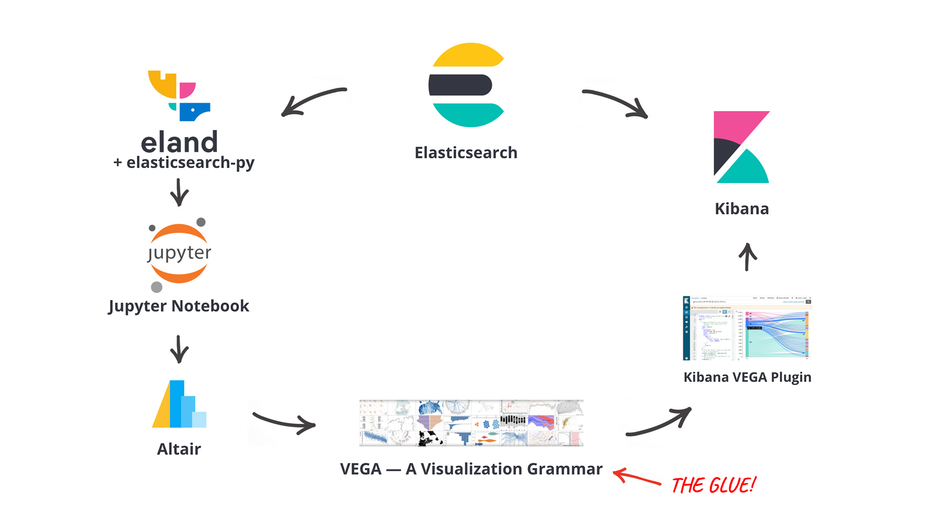
This repository consists of several Jupyter Notebooks to demonstrate a workflow mainly using Altair to develop visualizations which can be published to Kibana Dashboards. One of the main benefits of this approach is that a data scientist can continue to work with the environment they are most familiar with, without touching raw VEGA JSON specifications or coding custom JavaScript visualizations.
Notebooks
1a-flights-histogram.ipynb
This covers how to get data via eland from Elasticsearch and discussed some different approaches how to visualize small multiples of binned histograms with eland and Altair. It covers the basic requirements to successfully create and publish a custom visualization from Jupyter to Kibana.
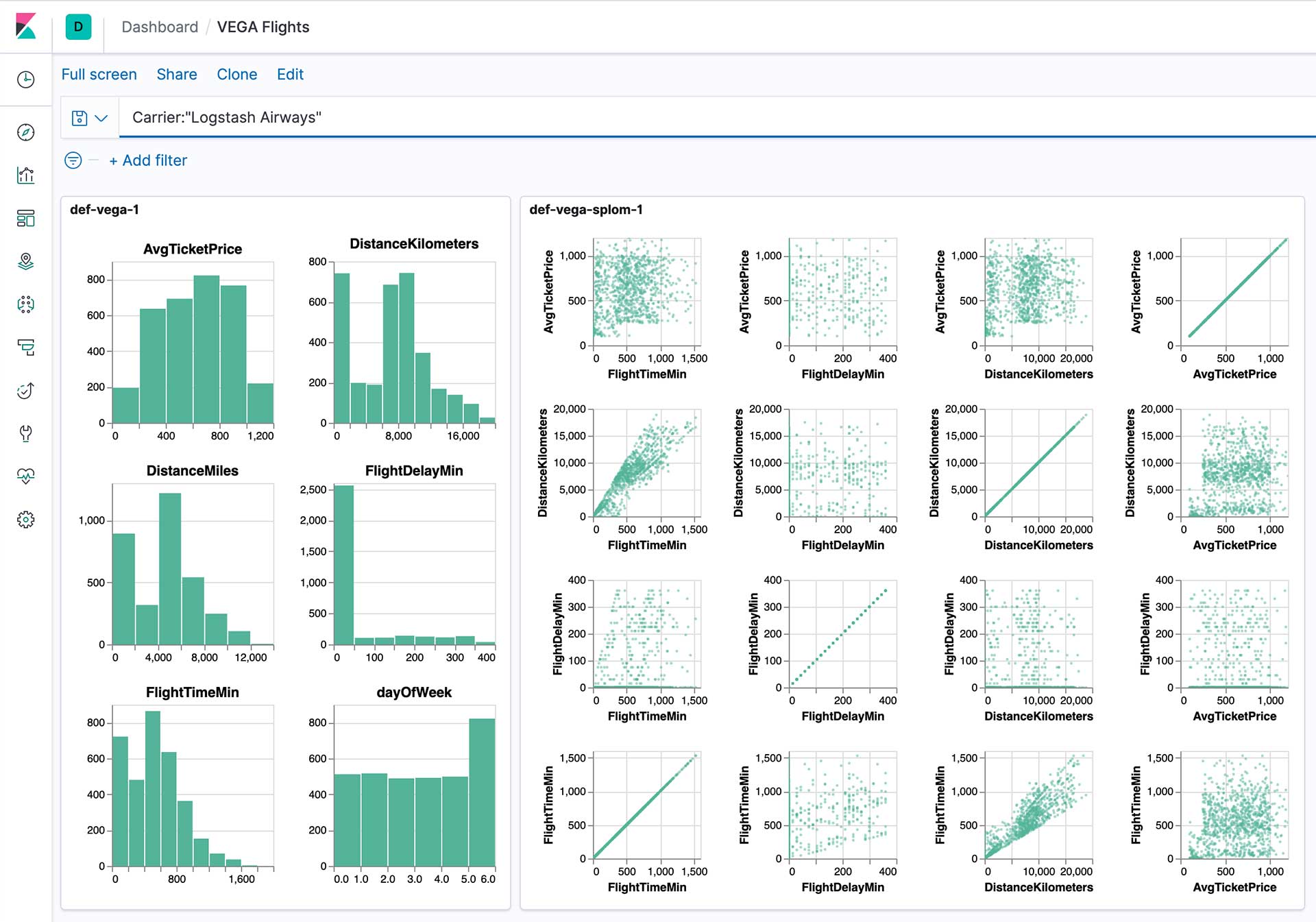
1b-flights-splom.ipynb
This notebooks builds on the learning from the first one and uses the same data to create and deploy a scatterplot matrix. The difference here is that we moved the code to create the SavedObject in Kibana to a helper function into kibana_vega_util.py so we can reuse it.
The two visualizations can be combined in a single dashboard and will consider filters added via the KQL query bar:
2a-cars-splom.ipynb
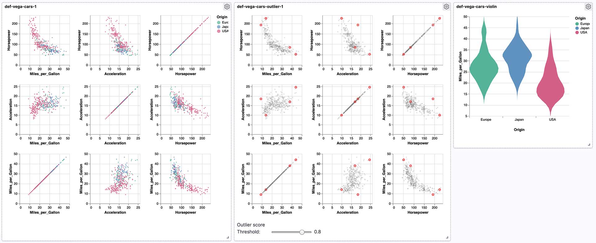
With this notebook we're creating another scatterplot matrix using the cars dataset you might know from Vega. However, this time we're taking the data from outside Elasticsearch and index it using eland.
2b-cars-outlier.ipynb
Before moving on with this notebook, we used Elasticsearch's Machine Learning to detect outliers on the cars dataset. We then use the newly created index including the outlier metadata in this notebook to create a scatterplot matrix that highlights these outliers. Additionally it includes a Vega based slider to adjust the threshold for highlighting.
2c-cars-violin.ipynb
The final chart for this second dashboard is a violin chart to show the distribution of Miles per Gallon over different areas.
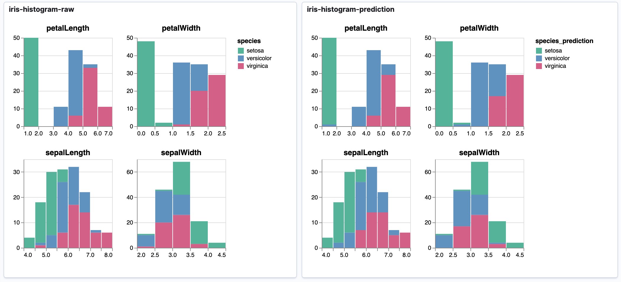
3a-iris-classification
This notebook demonstrates how small multiples of stacked bar chart histograms can be used to evaluate machine learning results, in this case comparing original values to predicted categorizations.
4a-anomaly-detection.ipynb
This notebook demonstrates how to replicate one of the custom charts of Kibana's Machine Learning plugin as an embeddable chart for dashboards.
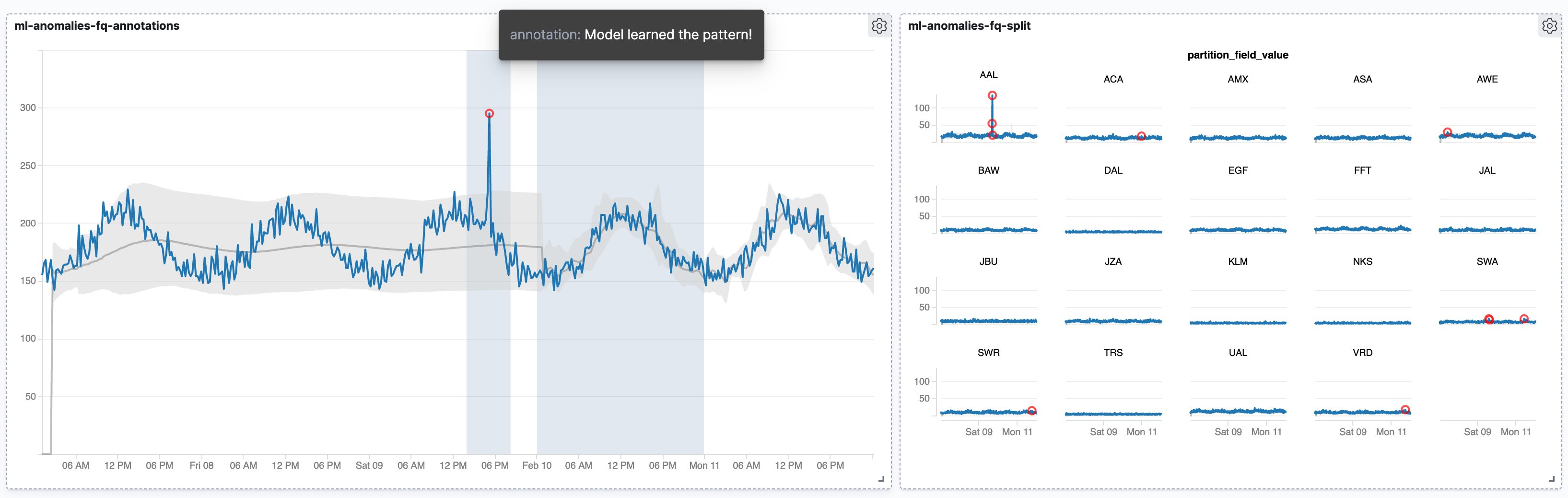
4b-anomaly-detection-annotation.ipynb
On top of the previous example this adds user created annotations as an additional layer to the visualization. It's a great example of how VEGA is able to fetch data from different sources/indices, something not easily doable with Kibana's own visualizations.
4c-anomaly-detection-split.ipynb
In this example we're back at using small multiples to visualize data about distinct entities with highlighted anomalies.